

In the ever-evolving landscape of React app development, where lines of code converge with the demands of remote collaboration, a new narrative is emerging—one that goes beyond the conventional wisdom of best practices. Welcome to a series where we unravel the intricacies of being a Remote React App Developer, shedding light on not only the tried-and-true patterns but also venturing into the uncharted territories of the most underrated design strategies.
Embracing the Remote Paradigm
As the digital realm continues to redefine the workspace, React developers find themselves at the forefront of a remote revolution. The challenges of creating seamless user experiences are now accompanied by the complexities of distributed teams, asynchronous workflows, and the constant pursuit of efficient collaboration. It’s in this context that we embark on a journey—armed with React’s declarative syntax and component-based architecture—to discover how the nuances of remote work reshape the very fabric of our development practices.
Beyond the Horizon: Unearthing the Unseen
While the React ecosystem is brimming with well-documented patterns, this series is set to explore the hidden gems that often lurk in the shadows. These underrated design patterns harbor the potential to elevate your remote React app development game. From optimizing performance in a distributed environment to fostering team cohesion across time zones, we aim to bring forth the unsung heroes of pattern design.
What Lies Ahead
Throughout this series, we will navigate through the practical, the theoretical, and the often overlooked. Each installment will peel back the layers, offering insights, strategies, and real-world examples that empower you to thrive as a Remote React App Developer. Expect to not only hone your skills in line with best practices but also to uncover those subtle, game-changing patterns that have eluded the spotlight for too long.
So, fasten your seatbelts as we embark on this exploration together. The road ahead promises a blend of innovation, collaboration, and a deeper understanding of what it means to craft exceptional React applications in the era of remote work.
In the imminent times, we find ourselves in a scenario where the need arises to pass props and exert control over the behavior of child elements. A quintessential example is illustrated below, where a Modal component encapsulates various elements, each serving a specific purpose:
<Modal showCloseButton>
	<title>Modal title</title>
	<contents>Modal body text goes here.</contents>
	<dismissButton onClick={close}>Close</dismissButton>
	<actionButton> onClick={save}>Save</actionButton>
</Modal>
This snippet showcases a Modal component with customizable features. The inclusion of showCloseButton as a prop allows for dynamic control over the display of the close button, and within the Modal, distinct child elements like title, contents, dismiss button, and action button contribute to a modular and customizable design.
As we delve into the details of this composition, we’ll uncover the power of passing props and shaping the behavior of individual components—a practice that adds a layer of flexibility and fine-tuning to our React components. Join me as we dissect and explore the intricacies of this React component arrangement.
The times are near when we would like to pass props and would want to control the behavior of child elements. For example, in the picture given below, you can see there are different elements:
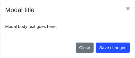
- A title section that is written at the top.
- A cross button to close the action present at the top right corner.
- A content area where you can write some text.
- A button to save the changes, “Save changes”.
- A dismiss button to close it, “Close”.
Now, if we want to reuse the Modal properly, we must modify the modal and its elements. This means that users will get control over things such as the content which is displayed, the dispatched events, the style of the content, and all other elements of the Modal that will be under the control of the user. Users can select a naïve solution for the acceptance of proposed for each element like they are:
<Modal
  showCloseButton
  showDismissButton
  showActionButton
  title="Modal title"
  contents="Modal body text goes here."
  dismissButtonText="Close"
  actionButtonText="Save changes"
  handleDismiss={close}
  handleAction={save}
/>
The problem with this kind of approach is that it spams the mechanism of propos, and this makes the whole component look less readable and more inflated. While on the one hand, it is less attractive, at the other end, it limits the amount of propos that users can pass to child elements. This method also prevents users from having complete control over the elements. However, you can solve this problem through another way by providing generic props objects where every prop object is representing a different element:
<Modal
  showCloseButton
  title="Modal title"
  contents="Modal body text goes here."
  dismissButtonProps={{
    text: 'Close',
    handler: close,
  }}
  actionButtonProps={{
    text: 'Save changes',
    handler: save,
  }}
/>
However, this solution works fine, but it does not solve the issue of spam, and you are completely abusing the syntactic sugar that JSX provides you in this way. You are obligated to use JSONs style attributes instead of using the HTML style attribute assignments (attr= “value”).
Using Bootstrap for the rescue
They take a very shrewd approach in Bootstrap, and that is instead of defining props all over the places, they gave us the capability to manipulate the Modal’s children directly. Now, we can achieve this intended functionality by using the dedicated components that Bootstrap was aiming for:
<Modal.Dialog>
  <Modal. Header closeButton>
    <Modal.Title>Modal title</Modal.Title>
  </Modal.Header>

  <Modal.Body>
    <p>Modal body text goes here.</p>
  </Modal.Body>

  <Modal.Footer>
    <Button variant="secondary" onClick={close}>
      Close
    </Button>
    <Button variant="primary" onClick={save}>
      Save changes
    </Button>
  </Modal.Footer>
</Modal.Dialog>
As you can see, the progress is there, and things are getting better, but we can take it to the next level.
Although things are very declarative and clear and we can stay here, but we are still obligated to compose an entire modal to the next level. But this would mean that we would not be able to use the Modal’s children to cover up the missing pieces, as we implemented the part of the logic before. Normally, it is not like that we have to write the Modal’s content from scratch.
Moreover, you can use it as a template for your use in future cases. However, there is no filter or restriction on the children’s input, and you can use it the way you want. But normally, we would like it if the user uses only a few limited elements so that he does not mess up the things, and if that is the case, we must see what could be the right approach to follow it.
Introducing the design pattern that contains everything
Now, if we see our last progress and calculate what we gathered so far, the new pattern should have the following attributes:
- Has complete control over child elements using props.children.
- Has a template already in place for the user.
- No spamming of the mechanism of props.
- Has restrictions on the input.
Well, this sounds good and promising so let’s take a look at an example and we will be using the Bootstrap Modal component it as an anchor:
const ModalFromTheFuture = ({ showCloseButton, children }) => {
  const childProps = useChildProps(props.children, [
    'title',
    'contents'
    'dismissButton',
    'actionButton',
  ]);

  return (
    <Modal.Dialog>
      <Modal.Header closeButton={showCloseButton}>
        {childProps.title && <Modal.Title {...childProps.title} />}
      </Modal.Header>

      <Modal.Body>
        {childProps.contents && <p {...childProps.contents} />}
      </Modal.Body>

      <Modal.Footer>
        {childProps.actionButton && <Button {...childProps.actionButton} variant="secondary" />}
        {childProps.dismissButton && <Button {...childProps.dismissButton} variant="primary" />}
      </Modal.Footer>
    </Modal.Dialog>
  );
};
Now you can clearly view that the new modal component uses a hook known as “useChildProps(). Moreover, this hook will basically flatten nested propos by going through the ‘props.children’. Furthermore, when it will come to make sure that right names are addressed, this method will validate them against a provided white list.
const useChildProps = (children, whitelist) => {
  return useMemo(() =>
    [].concat(children).reduce(
      (childProps, child) => {
        if (whitelist && !whitelist.includes(child.type)) {
          throw Error(`element <${child.type}> is not supported`);
        }

        childProps[child.type] = child.props;

        return childProps;
      },
      [children]
    )
  );
};
<ModalFromTheFuture showCloseButton>
  <title>Modal title</title>
  <contents>Modal body text goes here.</contents>
  <dismissButton onClick={close}>Close</dismissButton>
  <actionButton onClick={save}>Save changes</actionButton>
</ModalFromTheFuture>
However, we know it will cause confusion with native HTML tag names, but this can be said about any other React component being used by other users or us. But if you see the changing trends, such as the introduction of component-based user-interface, for example, Angular, Vue, React, or other web components, so new tag names are not rare now. Therefore, you should go for the new design and must not stay afraid of getting hands on it.
If you need to hire Remote React App Developer then you can contact me.


Artificial Intelligence Developments
Opportunities and Risks of Artificial Intelligence
Latest on Artificial Intelligence
Advance Your Skills with Amirdrassil Boost
atdh raid carry http://www.amirdrassil-boost.com.
useful invention ideas [url=http://the-word-online.com/#useful-invention-ideas]ironing board[/url].
journalism jobs social media.
augmented reality media refers.
It is very comforting to see that others are suffering from the same problem as you, wow!